Monday, January 24, 2011

SAMPSON CUBISM

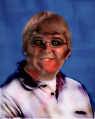
When we got this task, I knew immediately that I wanted to take pictures of my cat and mold them together and make them into a cubism picture. I don't know why I chose him, but I am glad I did. According to Mrs. Reidel, Sampson, which is the name of the cat in the picture, is ugly. So now this picture turned into every different view of what people can think of something or someone due to their appearances. The main highlight of this picture is his ears and face. Usually, the first thing you notice about someone is their face and their appearance. Although, I would find it a bit weird if the first thing someone noticed was their ears. Probably would have an ear fetish, something that would make anyone uncomfortable. As you can tell, I pasted the eyes on a lot. They always say that the eyes are the window to the soul. Or, they could be the window to the soul in which the person is missing. Just a thought.

To make this picture I had to take pictures with my camera, I mean what else would I use, and took pictures of the different views of Sampson. I took one from the top of his head, the side of his face, front view, and looking up at him. Unfortunately, I didn't need the one looking up at him, although it was pretty cute. Next, I used the lasso tool and drew around his face; then I copied and pasted it all together. Next, I had to feather the images to make them blend together better and look like they belonged there. Then, I used the square cut out and copied and pasted different parts of the picture and his face, and posted them on different areas. As you can tell if you really look close, I filtered some of the cubes and used the Filter > Brush Strokes > Accented Edges tool. This was to create difference and show not everything is the same as how it looks or how you think it is based on appearances. Give it a chance before you judge. Not everything is as black and white or as ugly as you may think it is. Beauty isn't in appearances. Beauty is in whatever you find underneath. Beauty is whatever is beautiful in the heart.

- Gorecki.

Monday, January 17, 2011

Multicultural Festival Poster.


For this task we were given, we were to make a poster for the multicultural festival. These events really make you think about how much the world depends on each other and how connecting with different people from around the world is interesting and fun, it is always good to make new friends despite where they are from. Everyone is human and we all want to live together connected lovingly in one world. We are lucky to have all these amazing different unique people who come together to be part of the society. Alone, we are only humans, but together we are a community.

I used the colour blue because it seems like a worldly colour. More than half of the earth's surface is covered in water, which is blue, obviously. The gray and blue contrast each other, so that is why I chose gray as the background colour. The background is not as important as the flags at the top and bottom of the page. Unfortunately, I couldn't get every flag of the world, but I am hoping I didn't offend by missing one. That is not the point of this. The point of this is to show how we can come together, despite differences, not because we have to (cause in the end we ARE stuck on this world together) but because we want to. I used a picture of a heart and contrasted it in the blue that borders behind the flags, and then the world in the middle of the heart to show we all are connected. In the end, we all love and care about one another because in the end we are all human and want to be cared and loved by others.

I used the paint can tool to fill in the colour of the border and heart, then used the text tool to add the font, then had to re-size the images to make it all fit and look right, and then I used the paint brush tool to fill in the black in the circle. TA DA. My picture. Overall, I'm not sure it's my best work, but it's the best I can do in the short amount of time when my computer WAS working.

-Gorecki.

Friday, January 7, 2011

Photo Restoration 2


This picture has taken me a while to finish. There are still some little bumps and areas that I need to and want to fix but right now, I am happy with the end result I have achieved.
(MORE EXPLANATION TO COME!)

-Gorecki.

Monday, January 3, 2011

Honesty of Poetry


This picture shows "teen angst." Poetry is used to express feelings and emotions towards something. Usually teens use poetry as an escape. Either they write about love or death. The emotion is true and they will always feel as strong about whatever they are writing about for the rest of their lives. But then again, teens are going through a lot, and later on in life they will think that THIS was challenging, whatever is happening to them right now. This picture shows the thoughts, expressions, and feelings of high school teenagers. Their thoughts are about either life or death. Love or hate. Different dimensions of writing and poetry make us different and set us apart from each other, and it also brings us closer together as human beings.
To make this picture I made the dimensions that were needed, then I chose a picture of a skull. At first it was oddly placed but then I added a picture, well a painting, of a heart shaped tree. I changed the layers so that the skull was in the front. Then I used the burn tool and added depth and shadows underneath the tree and around the skull. Next I used the text tool and added the title. It's a pretty simple picture, but it says a lot.


- Gorecki.

Monday, December 13, 2010

Photos Restored

Okay so here is the photo I restored. There isn't much of a difference, but I hope you like it, and find it satisfying. I don't know who these people are, but if the person who actually owns this photo, if they find it, then well I restored it for you. Your welcome. Don't worry. No favors. Just money. KIDDING! Stephen and I did the same photo, I think his is better. Just saying.


Before and After

To create this picture, I used the cloning brush and took away the white lines and yellow-ish border around the photo. Next, I changed the yellow-ish colours to white, so that the picture looked more realistic and didn't seem to be as old as it looked. To do this, I used the Enhance, Adjust Colour, Replace Colour tool, and adjusted the lighting (contrast and brightness) of the photo. Then, I used the sharpen tool to make the photo not look so blurry or fuzzy. Viola! A new photo, from the old photo.

- Gorecki.

Wednesday, November 3, 2010

Gorecki Digital Paintings

This is not my fortay. They suck I know, but I tried. I feel like I am better with photo manipulations. Here are two paintings I have done.

"Our Murder"

To make this picture I started with a blank canvas specified to the specific page size requirement. Then I used the paint can and painted the background black. This image consists of many different layers. Layers are key. First, I started with a paint brush, in the biggest size I could make it, and then I painted a squiggly line in the bottom left corner. Then, I went to Filter, chose the motion blur button, and chose radical, and changed the specific area to make the curve and lines. Then I wanted a bright colour, so red, and did the exact same thing but did not make the lines so big and spaced out. Next, I made another white line over the circular white layer and used Filter, Wind, and gave it a weird affect to create some sort of fog affect. Then, there was an empty space, so I made a red circle and added a blue line in the middle using paintbrush, and paint can. Then, I went to filter, motion blur again, and used the linear choice. I changed the length and area of the lines to make the circle end up the way it did. I looked at this picture and said to myself that I thought it looked like a reflection in water of the moon, and there was a weird ripple in the water. So, lastly, I added another grey line, Filter, Motion Blur, and blurred the line to make it look like a weird cloud covering the moon.

This picture represents a different time. Everything is disrupted and looks off. The moon is red, and hurt, and there is a secret in the air. This picture is like a murder scene, everything is there, but the little details are always missed. The lines across the moon look like they don't belong, but they really do. There is an eery-ness in the air, or in this case, in the picture, or the reflection on the water. The moon is hiding behind something, but what? This picture is a reflection of someone, we all have secrets and hide behind a lie. What's yours? We change our reflection of ourselves in many ways.

"The Balance"

I created this picture by starting with a canvas size that was "9x11." Then I used the paint can and painted the background black. Then I used a pink gradient and drew a line to make the bigger shaped triangle. Next, I added another layer and added another gradient in a smaller triangle on the right side of the picture. This gradient was blue and it faded into a lighter blue into the right side, and I screened it over the original picture. After adding another layer, I used a yellow/orange gradient in the form of a triangle on the left side of the picture, and dodged it over everything. ( The smaller triangle. ) Next, I used the white paint brush and drew out squiggly lines in the bottom right side of the picture. Then, I used Filter, Motion Blur, Radical, and the squiggly lines turned into a weird circle. This created a light side to the picture, and then the other side I did the exact same thing but with a black paint, and didn't make the lines so big. I think this balanced out the picture well. There is the light side, and dark side to the photo, and each side has a circle that brings you into each side. This could be metaphorical for that our lives are all about choices. There are the choices that bring us into the dark side, and the other choices that can bring us into the light side. It is just a matter of which side you want to be on, and who you want to be. Though, there is the balance of good and evil in this world, and they balance each other out. There can't be one without the other.


- Gorecki

Saturday, October 30, 2010

Beckinsale Graceling


While working on my overlay project and making my face a lion, I was working on my culminating for English. The culminating was we had to read a book and take a character from the book and make an essay on them. I read the book Graceling. Of coarse, I read this book before and absolutely loved it, and there is also a prequel/sequel. You can make it both. A graceling is someone with two different coloured eyes and they have a special talent. This talent could include mind reading, seeing the future, fighting, etc, but no two gracelings are the same. Katsa is special, she has the grace of killing. She has one blue eye and one green eye, and she was the inspiration for me. Due to the fact this isn't a real person, I got inspired while watching the movie Underworld ( I'm a big fantasy freak ) and thought about using Kate Beckinsale. She does a lot of kick-a** movies and I think she would be the person Katsa. Though the age difference might be a little bit of a problem, considering Katsa is supposed to be 18, and Kate Beckinsale is 30-40. Anyways, here is how I made my Katsa.

Firstly, I had to change the eyes, so I took the lasso and drew around the eye, then used a bright blue colour and painted over the area with the paint brush. I changed the eyes by changing their normal, and having it react with the original colour of her eyes. (The button around the opacity) This is how I created her dynamic different coloured eyes. Then, using the burn brush, I shadowed all around her face, making her features more prominent. Then, I used the Enhancing button to change the contrast and brightness of the picture, to also make it more dynamic. After, I found a texture that was cracked and added it to her face but overlaying it. I wanted the scars to look more raw so I took the paintbrush and painted over the lines in red, then overlayed it. I think this gives the picture more of an edge, and shows all her battles she has been through and her strength. Lastly, the blood. That was the trickiest part because I had to make it look somewhat real and not so much painted on. I used different layers and different shades of red and changed the opacity and layer. (Again, using the button around the opacity) I am not so sure about the blood but I think overall I am happy with what I did, in only 10 minutes.

- Gorecki.